AI Brand Image Checklist for Consistent Visuals
AI-Powered Brand Image Checklist: A Simple System for Consistent Visuals
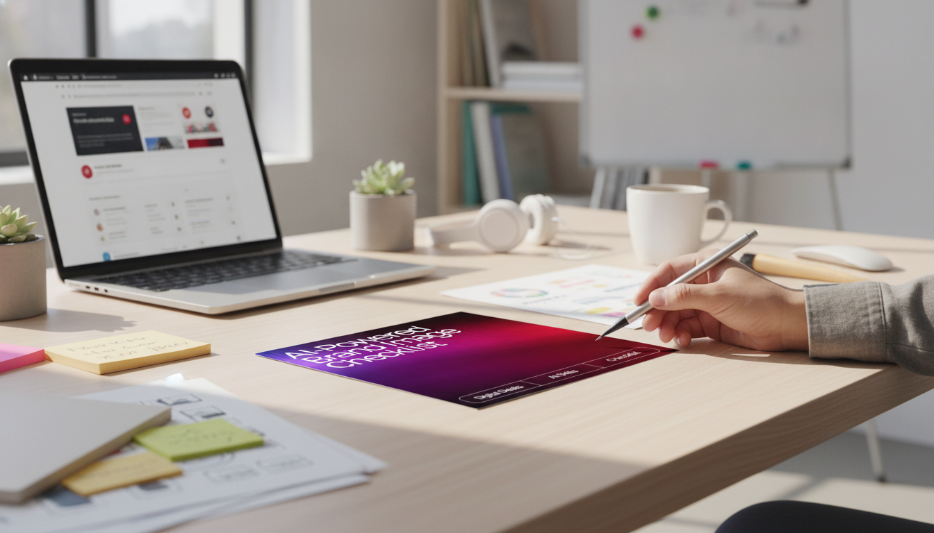
Strong brand visuals don’t come from luck or endless tweaking—they come from repeatable decisions. When every image is guided by the same purpose, audience cues, style rules, and quality checks, your visuals start to feel “obviously you” across platforms. That’s exactly what an Etsy-style printable checklist is built for: a simple, reusable system to plan, generate, evaluate, and refine AI-assisted brand images without drifting off-brand from post to post.
Who This Checklist Is For
- Creators building cohesive visuals for social posts, thumbnails, and digital products
- Small businesses needing consistent product imagery, lifestyle visuals, and promotional graphics
- New brands defining a look (colors, mood, typography, photo style) before producing lots of assets
- Teams that want a quick review process to keep AI-generated images on-brand
What You Get (Digital Download)
- A printable checklist designed to guide AI-assisted brand image creation from start to finish
- A step-by-step flow: define brand cues → generate options → evaluate → finalize → organize for reuse
- A repeatable review section to reduce “almost right” visuals and improve consistency
- A lightweight format that can be reused for each campaign, product drop, or content batch
If you want a ready-to-use version, the AI-Powered Brand Image Checklist (Digital Download) is designed to be printed or used digitally for quick, repeatable reviews.
Brand Image Foundations to Set Before Generating Anything
Consistency starts before you generate a single option. The goal is to define a small set of “non-negotiables” so your visuals don’t change personality every time you make something new.
- Brand goal for the image: awareness, conversion, education, announcement, or storytelling
- Audience cues: what the viewer needs to feel and understand within 3 seconds
- Visual direction: color palette, contrast level, lighting style, composition preferences, and texture
- Distinctive brand elements: logo usage rules, icon style, patterns, framing, and whitespace
- Content boundaries: topics to avoid, sensitive categories, and any compliance requirements
If you’re refining color decisions, a quick refresh on fundamentals helps keep choices intentional. Adobe’s overview of color theory basics is a practical reference for palette and contrast direction.
AI Image Creation Workflow (Checklist-Style)
A repeatable workflow prevents the common trap of generating dozens of “close, but not quite” images. Instead, you create controlled batches, evaluate them against the same rules, and save what works so the next round is faster.
- Define the asset type and placement: Instagram post, Etsy-style listing image, website hero, email banner, or ad
- Gather inputs: reference images, color hex codes, type pairing rules, product photos, and mood direction
- Generate variations in controlled batches: change one variable at a time (lighting, angle, background, props)
- Evaluate against brand rules: mood, clarity, relevance, and consistency with existing assets
- Refine and finalize: remove distracting elements, correct proportions, align with typography and spacing rules
- Export and organize: name files consistently, store source notes, and save winning settings for reuse
Quick Quality Checks That Prevent “Off-Brand” Results
- Clarity check: the subject reads clearly at small sizes (mobile-first)
- Consistency check: colors and lighting match the last 10 brand visuals
- Authenticity check: details look intentional (hands, text in images, product edges, reflections)
- Accessibility check: sufficient contrast and legibility if text overlays are used
- Usage rights check: avoid using protected logos/characters and avoid mimicking a specific living artist’s style
For text overlays and legibility, the W3C guidance on minimum contrast is a reliable benchmark for accessibility-minded design.
Examples of Brand Image Types You Can Standardize
- Product listing images: clean background, consistent crop, consistent shadows
- Lifestyle scenes: repeatable set of props, angles, and lighting temperature
- Quote or tip graphics: same margins, font rules, icon style, and background texture
- Launch visuals: consistent headline hierarchy, accent color, and callout placement
When you standardize just 2–3 variables per asset type (like crop + lighting + background texture), your brand starts to look cohesive even when the content changes.
Consistency Scorecard (Use This When Reviewing Options)
Use a simple scoring pass before committing: it reduces decision fatigue and keeps visuals aligned over time. Aim for a minimum threshold before final export; save borderline options for testing rather than primary use.
| Criteria | What to Check | Score (1–5) |
|---|---|---|
| Brand fit | Matches the intended mood, audience expectation, and core message | |
| Color & lighting | Palette alignment, lighting temperature, and contrast level | |
| Composition | Clear focal point, readable at thumbnail size, intentional whitespace | |
| Detail quality | No awkward anatomy, warped objects, or distracting artifacts | |
| Reuse potential | Can be adapted into a series without looking inconsistent |
When you’re deciding between finalists, visual hierarchy is often the tie-breaker. Nielsen Norman Group’s explanation of visual hierarchy is a helpful reference for keeping the focal point and reading order intentional.
Printing and Using the Checklist Efficiently
Recommended Digital Downloads
- AI-Powered Brand Image Checklist (Digital Download) for creators and small businesses who want consistent visuals across product imagery, social graphics, and campaigns
- AI Tips to Elevate Your Writing Voice (Editable Tone Checklist) if you want your captions, product descriptions, and emails to sound as consistent as your visuals look
FAQ
What file type is included and how do downloads work?
It’s a digital download (commonly delivered as a printable PDF), so there’s no physical shipping. After purchase, you can download the file and use it digitally or print it for repeated use.
Do AI-generated brand images need to match across every platform?
They don’t need to be identical, but they should feel like the same brand. Keep core elements consistent—palette, mood, composition rules, and typography—while adjusting sizes and layouts for each platform.
Can this checklist help if brand visuals already feel inconsistent?
Yes. Start by defining your foundations (colors, lighting, composition rules), then use the scorecard to audit existing visuals and set a clear standard for future batches.










Leave a comment